They say "A picture is worth a thousand words", when it comes to SAP Performance management, or any performance management for that matter, I tend to agree - I'm a very visual kinda guy! I like lots of charts because I can visually correlate many metrics and spot problems much faster than I can with numbers. Well, our R&D team has out-performed themselves this time as I'm pretty excited about their latest feature enhancements. I've gone nuts over pop-in charts to diagnose problems like I could never have done before so easily with any SAP monitoring tools such as those I mentioned in the SAP Performance Tools Comparison.
Let's get to why I'm nuts about the latest IT-Conductor charting features and also summarize the "Charting with a Purpose" mantra we have:
- It's not just about pretty charts: Charts have to be functional - click-in, drill-down, annotate, compare, correlate, share, apply thresholds, and even automate recovery actions
- Charts have to fit in Context: Application-centric management requires all components to be related to a service hierarchy, otherwise, the chart and information can be taken out of context, and then we tend to overreact
- Charts have to be accessible: Go cloud! Private, Public, Hybrid, whatever, just make them easily accessible and web-based or they'll be next to worthless.
Here's a link to Visual Root-cause Analysis examples of how we can use functional charting to Automate IT.
New Features
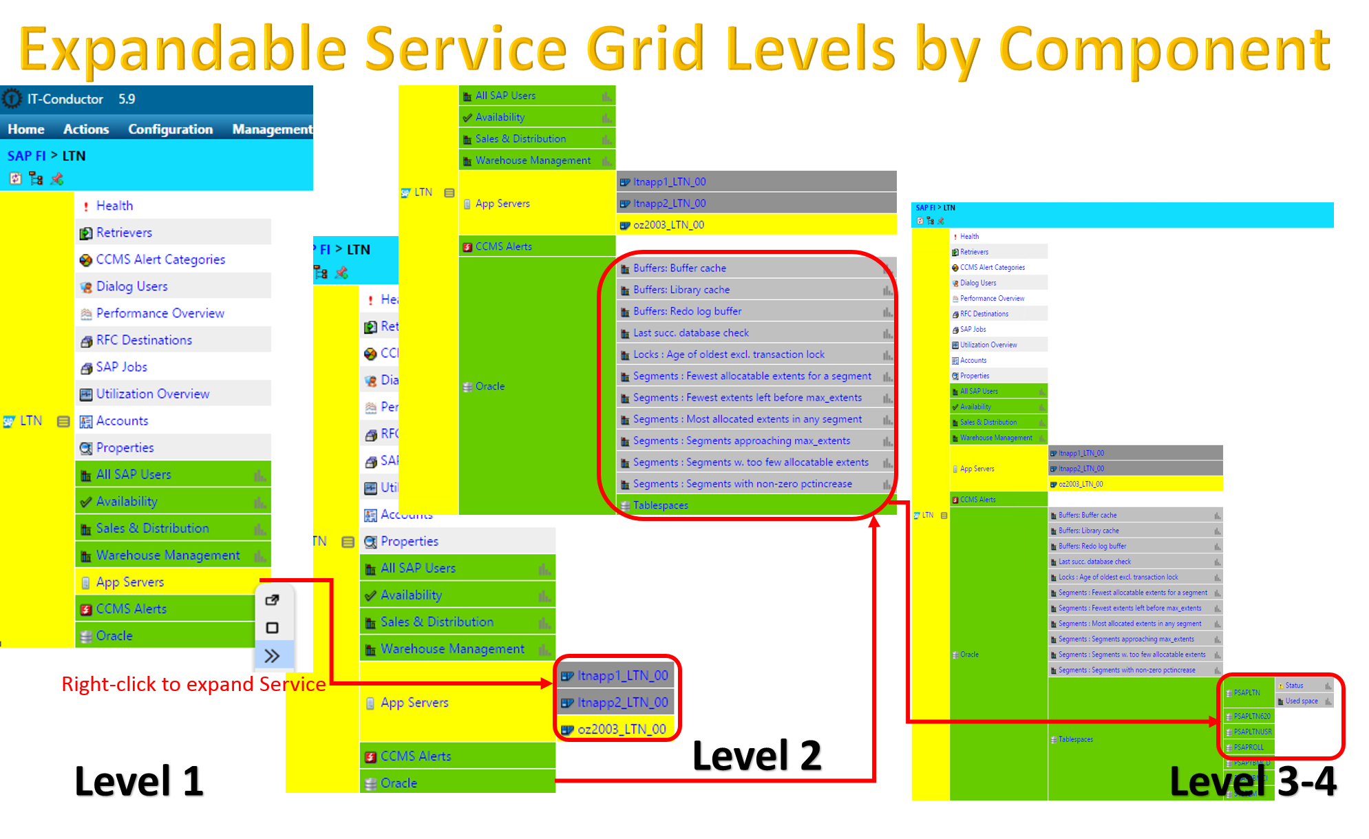
Expandable Service Grid Level by Component
The Service Grid is the heart of IT-Conductor and has always been expandable to multiple depths (1, 2, 3, etc.) to the leaf-managed service item (monitors, etc.), but now we have added the ability to expand the level for only specific components you choose. It acts like a tree that you can open/close branches, yet still lets you see the relationship and impacts.

Pop-in Charts
In any Service grid, managed items such as Availability, SLA (such as user or transaction-specific workloads), Alerts, Performance metrics, and DB space metrics, click on the Chart bar icon once to 'pop-in' a chart inside the same browser page (not a browser pop-up or new tab), and you can continue to pop-in any number of charts you like, resize/reposition them inside the page as needed. Drill into the chart (or click on the Chart title) for a full view and chart controls which allows performance intelligence functions detailed in mantra 1 & 2 above.

Summary
If you love Performance Charting and find it hard to find the performance charts to tell your performance stories, you could end up downloading data and charting them in spreadsheets. While spreadsheets and charting applications can be great, they remove the usefulness of integrated data analysis. Performance management should be easier with our "Charting with a Purpose" mantra!
Since you can connect and monitor up to two SAP systems including HANA for FREE, why not give it a try? Subscribe to our cloud-based IT-Conductor. With a few clicks and a few minutes, you can monitor and alert your SAP systems. Go Nuts with the SAP Performance Charts!
